Wednesday, 30 January 2013

'The King's Speech' Poster Review by Lisa Walden

The poster of this film really is a feast for the eyes. It's enjoyable and inviting to look at. Makes anyone who hasn't seen the film want to see it. Graphology plays an important role in the making of a poster and together with text this cohesion creates something magnificence.


Narrative


The characters are communicated through the large centred images. They are clear and mise-en-scene assists in defining who the characters really are. From the name 'The King's Speech' it is evident to the audience that the main character is a king: Colin Firth is dressed in smart, luxe clothing standing by the famous doors of the palace. This connotes a message of royalty and that he is the king. Without even having to have watched this film it is evident from the poster what it is about. You see the crowds of people, the gold writing, the crown placed on the I in King's and the smart tailored suit and you automatically know a brief outline of the story.

The fact that the name of the film and power-connoting image help to portray the narrative through the poster enables the audience to get a feel of the film through the powerful poster. The image of the palace view and smart attire that the cast are wearing additionally assists in speaking the narrative through the film advertisement.  
 
Representation
 
This poster represents power, high class and status. As it is evident from various features, power is specifically   portrayed because he is a king. Not only is this apparent from the title of the film 'The King's Speech', but the gold-hued text and gold embellished detailing make power and wealth come alive.
 
As the film tells the story of a king and the impact he had on many people the poster obviously needed to speak that message to the audience; the message of wealth, power and shear strength and determination. The five stars above the name project success, making it a reason for people to come and see the film that little bit more. Often when films have won awards they like to display them on posters and in advertisements to gain a wider audience and breathe their success into the viewers so they are aware that the film is without a doubt a must see.
 
Genre

The genre of 'The King's Speech' is a historical drama and period piece which tells the moving story of King George VI and his battle with his stammer. Often with film posters it's challenging to identify the genre of the film, unless it's a thriller or horror, because if the poster doesn't reveal much of the story then it's difficult categorize the genre. 

It is evident that this poster represents it's category 'Historical Drama' as it uses representative images to portray the story of the King. In the background, there are zeppelins in the sky, showing what era the film is set in- it also connotes a message of war, enabling the audience to identify with the genre.  

As this film tells a story of a real life event, other genre categories that it could fall into are Historical fiction and biography. There is no evidence on the poster that tells the message about this film being based on a real life event. However, importance is connoted through gold-hued text, famous actors and the duo of 5 star awards. Even though from seeing the poster the audience might not know the overall story, they can see the power and importance displayed through the image/text cohesion.


Audience

Once the genre of a poster and film have been identified only then can the appropriate audience be distinguished. Any one who is interested in Historical Fiction and  biography's would be the audience of this film. This film could be targeted at those who are relatively interested in the Royal Family and historical events- seeing significant events portrayed in a film interest those who read up or learned about the events before hand.

Whilst doing my research regarding 'The King's Speech' targeted audience I came across a large amount of statistics showing that the audience of this film lies within the older generation. Although the expected audience are those of the older generation, students who have an enthusiasm for English culture and have some degree of historical curiosity are additionally members of 'The King's Speech' audience.  

Again, since this film uses a wide range of famous and much-love actors and actresses, people will come to watch the film who find themselves a 'fan' of that particular famous being. Colin Firth, for example, is an Oscar winning actor; someone that is likely to increase potential audience just because of his high status.


 Film Language

The lighting in this poster is light and refreshing which enables all the small details in the image to be identified. As this photograph is additionally a medium close-up: this allows the audience to be introduced to characters, surroundings and other aspects of mise-en-scene.

The gold embellishment details in the building and in the formal attire, allow wealth and power to be foretold. Without the audience even viewing this film, they are automatically introduced to a world that whispers deep opulence.

The lexis "King's Speech" marries in well with the chosen images placed in the poster. The text/image cohesion inform the audience of what is to come- a story about a king's speech. Seeing this inviting and eye-friendly poster gives you almost no reason not to see it. Perhaps it's the duo of 5 stars that scream 'watch me' to the spectators.

Editing - Dilys

Editing Our Short Film!

Colour and Lighting

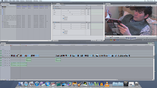
When editing the scenes we filmed at our characters house it became clear that the light in the shoots would need to be dramatically changed as the shots all had an orange glow that was due to the lack of light in the room we were filming in (details in Problems Faced When Filming). To begin with we changed the filters and the image control on the shots to help lose the orange tinge but after many alterations the shots at the home finally all looked much more clean and appropriate. Upon watching the film through with the new colour changes we decided that we preferred the colour on the shots as it highlighted the coldness and fear the boy lives in at home so we desaturated and gave them an extra blue tinge to all the shots filmed at his home to clearly show his dislike of living there. 


We changed the colour of all the shots take when the boy is at his home to help establish him as a character who is unhappy with his circumstances. We reduced the red on all the shots and raised the blue and green to help lose the life and vitality of the shots to convey his loneliness and depression.


The Start of Our Poster By Lisa Walden


We have already begun to map together all our ideas for our poster so it can be become something to attract our targeted audience. Since we were both vague with the idea and functions of Photoshop it took a little longer than expected to create the design we were after. We had in mind the image, taken from our film, that we wanted to use and were certain that it would work perfectly as the image to represent our short film. Here I have screenshot the first ideas from our advert to allow you to see a little of what the final product will look like. We have the main text already placed onto the text- the only stages left are adding in the logo's of companies and finalising the arrangement of the page. This Photoshop experience has been fun and challenging both together. We take pleasure in starting new activities and learning new skills so this was a task we couldn't wait to start. With our targeted audience in mind we wanted to create something which initially becomes a feast for the eyes; something inviting and pleasant to look at. We are looking forward to completing the final stage of our poster our film can really come alive in a media sense, and so it can project the deep meaning lying behind our story.


This is the start of our poster- we wanted to capture a moment from our film to foretell the story still to come.


This is an image taken from our short film which we then decided to use as the main image for our poster.


Tuesday, 29 January 2013

'Ginger and Rosa' Poster Review by Lisa Walden

The poster of this film really is a feast for the eyes. It's enjoyable and inviting to look at. Makes anyone who hasn't seen the film want to see it. Graphology plays an important role in the making of a poster and together with text this cohesion creates some magnificence.


Graphological Features
 
The lexicons 'Ginger' and 'Rosa' are written in bold eye-catching font, and have been inked in the hue to match the name connotations. 'Ginger' is printed in the an orange colour to match her hair and the meaning of the name. This too applies to 'Rosa' as it is the French name for 'pink' which is also written in a light shade of pink. Using attractive font and images helps to create a poster that people are going to find interesting and readable- it will result in them looking up cinema viewings.
 
Along with a clear close-up image of the main characters there is also a small line of actors that feature in the film so that the audience are aware of who else stars in the film. A list of the cast are also shown because this being a film that features well-known and successful actors it is important that the audience are aware of who else makes an appearance. Often it is who stars in the film that will entice the audience into wanting to watch the film.

The task of a poster is to give away a slight hint to the audience but not letting the whole story slip. From this 'Ginger and Rosa' poster it is evident that the film is going to be focused around the two girls (their names given in the title) as they take the lead image on the poster. The rest is for the audience to find out. As I have seen this film, and saw the poster before viewing, I was unaware of the actual storyline and was just informed by the name that it would be a film of two girls, not knowing anything about them. That's what I find so intriguing about posters: they open a small window into the film but then when you watch it, a door is opened.  

Narrative

The characters from 'Ginger and Rosa' are communicated to the audience though the large images of them taking lead of the poster- as they are both the main characters, it is important to show their appearance, so the viewers are aware of which stars play in the film. In our film we have one main character who plays the lead role so we will be using him on our poster. This will make our audience aware of the character before even watching the film. 

Due to the expressions on the girls faces featured on the front of the poster, it makes us aware of how they might be feeling throughout the film and what may occur: they look slightly saddened and are looking in opposite directions, showing that although they are friends their lives could be diverting down two very different paths, or that they have different interests and aims in life.  

The two girls appear to be not wearing a large amount of make-up and are just shot with the wind blowing in their hair (this perhaps has connotations that they enjoy spending time outside) with a very natural look, which gives away signs of their age. Although this is not evident, one can piece together their ages from the image they represent. The colour of the font is also a child-like hue, suggesting that they are still in the early stages of their adolescence.

Representation

With the large image of the girls accompanied by the feminine text and colours, their gender is shown in a way that proudly presents their femininity. However because they are not illustrated in a 'stereotypical' female way (make-up, clothing, etc.) it shows a more modern approach of girls. For example, in the film they are trying to protest against wars, this however is something more usual of males rather than females. This film, along with the poster, is a fresh take on the vision of females.

The poster itself doesn't project any context that would enable the audience to identify with the girls region, nation or which social class they are in. Often the designers of the poster decide to keep all their background information private, which will make the viewing of the film much more surprising. 'Ginger and Rosa' are the very centre of the poster leaving no space for any mise-en-scene to reveal their region or social class.
 

 Genre

In posters that are advertising thrillers or horrors, the genre is much more easy to identify- seeing a dark background, with an isolated house immediately sends the audience a message that connotes fear. With films such as 'Ginger and Rosa' it appears to be more challenging to define the genre when the poster gives away little to no evidence of what the possible genre could be.


Audience

The audience of each film varies and is deeply dependent on the genre of the film. When a poster or advertisement of a new film is released, it attracts certain people dependent on how the film is portrayed.

'Ginger and Rosa' could have an audience of a variety of different people ranging from male to females from all sorts of ages. Being that the poster connotes feminine messages there is a possibility that the audience are more likely to be female. 

The audience is also very dependent on the cast that are featured in the film. For example those that are interested in the work of Elle Flanning would be more likely to go to watch this film than those who have never heard of her. With a list of cast- ranging from famous to those not so- will help gain a wider audience. Seeing actors and actresses that people are interested in will attract more audience. 

The graphology is fun, and inviting, which additionally attracts the audience. Seeing an attractive poster has connotations that the film too will be attractive and one worth watching. This is why posters and advertisement have such an impact on the targeted audience.           

Film Language

The lighting used in this poster is bright and highlights the faces of the two characters, Ginger and Rosa. Having a darker background, for example, would connote fear and possibly suggesting that something bad or mysterious is likely to occur. Good, light lighting portrays an image of a film which is likely to be happy. Plus it highlights the faces of the two girls, and shows that because the film is their names, they are clearly highlighted in the poster, making it more evident to the audience who the film features. As 'Ginger and Rosa' is featured underneath the light, clear image of the two girls makes it evident that this is who 'Ginger and Rosa' are and that the film must be about them.

The title graphics used on this poster are bold and inviting. The font and colour opted for are essential when attracting an audience. The bold, capitalised text is appealing and inviting, and the colours of the font connote the personality of the two girls- it also is the colour that matches the names. The list of cast names are written smaller than the focus names, Ginger and Rosa, so that the eye focuses more on the names of the girls, and is less distracted by an array of extra appearances.
 

Shooting Our Film by Lisa Walden

 
Throughout the process of filming we tried our hardest to capture meaningful moments so they could be presented here. We took images on the beach, by the derelict house and in the derelict fairground. Our location choices have specific meanings which foretell the story hidden behind the plot.
 
 
(Shot One)


(Shot Two)


(Shot Three)
 
 
Shot One

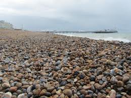
Shot one is an image taken from Brighton beach where we filmed part of our film. Here we are trying to create the perfect image of the waves as the meet with the stones on the beach. Since we fell in love with the beauty of the beach and how the images turned out on camera we decided to add a vast variety of the beach shots into our film to show the audience just how much our character loves and appreciates the stillness of the beach.

Shot Two
This image shows some footage taken from filming at the derelict house. This location deeply projects his inner emotions and enables the audience to build a connection with his lonely, isolated self. We used shots here to really portray that: we experimented with lighting, distort angles and full-body frames to show his inner feelings illustrated through body movement. Pathetic Fallacy is also relevant here as the horrible wet weather incorporates well with his inner sadness, making the audience feel more aware of how he really feels.

Shot Three
Again we are at the derelict house location, but this time hair and make-up is being dealt with to ensure that the actor portrays his image correctly. We used near to a whole tub of gel and combed it though his hair creating a neatly groomed and sleek look. This allows the audience to understand that he has slightly more of a feminine side, and appearance, for him, plays an important role. With the rain falling heavily we had to continually ensure that it looked the same throughout the various scenes- continuity editing had to be acquired and ensured it was kept the same throughout the scenes.  


Problems we faced filming - Dilys

LOCATIONS

When originally planning our short film we camer up with a list of over ten different locations that we could film at that would work effectivly in our narrative, these included Brighton Pier, The Pavillion Gardens, a swimming pool, a boat yard, a castle and a bowling alley. As we narrowed down our options we found some locations would be possible to film at and others werent and evetually we had our six locations.

We rang up Brighton Pier to get permission to film on and they agreed that it was fine, the rest of final choices we believed were all public places and we wouldn't need permission to film at them. However on the second day of filming we arrived at The Pavillions Gardens and a member of security asked us if we had permission which we reluctantly denied. So we were left wondeing the streets of Brighton in an absolute panic as it was one of the last days free we had to film, so we brainstormed a few possible ideas and decided that Brighton Beach would be suffice.

Filming at Brighton Beach worked well in our film as it was completly empty, which helped to reflect our characters isolation and it also has connotations of somewhere peaceful and happy which is exactly where a boy who feels bullied would chose to escape to.

Monday, 28 January 2013

Filming - Dilys

First Day of Shooting!

When originally made our schedule for filming we very confident with our location choices, our actor and we had felt ready to use our equipment efficiently. On the first day of filming we went to the abandoned playground to film a sequence of our character arriving somewhere which is different to what he drew a very important part of the film as it is the first sign of the disruption in the short, the boy has chosen not to go home but rather draw a drawing inside a drawing which has caused him to arrive somewhere desolate and unknown.

At first we were unable to find the location for the desolate playground as the address we had was vague and we had to search through the wood to find the place. Upon finding the abandoned playground we were disappointed as we initially thought it would be a large fairground but instead it was an open wood a selection of bumper cars. However we still filmed at the location and are pleased with the shots we managed to retain. In future we will be sure to check locations we have never visited or know little of so the same error doesn't occur again.

Second Day of Shooting!

On the second day of shooting we ended up on Brighton Beach which was a great location to film at as it was completely empty which effectively reflected our characters desolate state of mind. A problem occurred when we were filming upon the beach which constricted us in getting the exact shots we planned out initially, the pebbles were not smooth which meant many of the shots came out which was not the style of shot we wanted at all. Trying to resolve this problem was difficult at first especially with the wind nearly blowing the tripod over but luckily we managed to achieve straight tight shots.

The filming upon Brighton Pier was slightly disappointing to as when we planned to include it as a location we wanted our character to be playing in the arcade and unfortunately after phoning Brighton Pier we were not granted access to the arcades. Looking at it retrospectively I am glad they didn't allow us to film in the arcade as our character was slightly older then we originally planned and so having him playing on arcade games wouldn't work with the continuity of our film.


Third Day of Shooting!

On the final day of filming the greatest problem we faced was the size of our character's rom and trying to fit the camera and tripod in the room to get the right shot and at the right angle. The room we were filming in was very small and often it was very tight and difficult to get the exact shot we were after, particularly if it was a long or medium shot but I think we managed and having watched back the footage I think we the shots are good.

In our first storyboard we chose to have the boys paper and pencil in a draw which we would shoot a high angle of as he opened them. When it came to filming this segment it became apparent that there wasn't a draw in the room or another that we could film that would look liked it belonged in the room so instead we had to make a decision to have the paper under the boys bed and when he wanted to draw he pulled the paper out from under the bed.

The third problem we faced whilst filming at the characters home was getting the right lighting in the shots, although it was morning and there was bright light coming through the window there still wasn't enough light in the room. To overcome this we turned on the light in the bedroom to get more light into the shots but unfortunately looking back at the shots in editing we can clearly see the room has an orange glow. We have learnt from this that lighting is a very crucial part of filming and in future we need to plan carefully beforhand which exact lights will be nessasary in each shot.